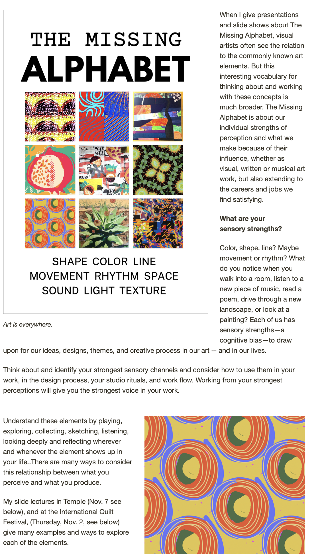
What does breakfast look like around the country? The world? Your house?
I'm working/playing with a group of 7-to-9 year old creative thinkers this week at the Aldrich Contemporary Art Museum in Connecticut in the second course of our New World Kids program -- it's called "Think Like a Pro," and introduces our young alumnae of NWKs to a more indepth look at their own creative process as well as a look at how different people in different fields approach creative work.
One of our projects -- combining social media, the theme of home and an installation designed by the kids -- has to do with collecting breakfast photos.
Here's the email that the kids came up with (with a couple of additions) and your instructions. Feel free to copy the request and send it out -- we want to see the diversity of what we humans eat each morning and the more, the better. Deadline for submissions is THIS THURSDAY at noon, since our exhibit (online and inhouse) goes live on Saturday. We'll send any who contribute a link to a site with all the photos.
Hello friends!
We are collecting breakfasts from everywhere. Please email us a photo of your breakfast for our exhibition.
Email it to: mybreakfast@me.com. We need it by noon on Thursday. (We'll send back a link to the results!)
Thank you from the "Think like a Pro" class at the Aldrich in CT, USA! (Be sure and tell us where you eat breakfast!)
Here is an example:

More about the program, for those interested (from my colleague and co-author Susan Marcus' letter to the kids' parents):
“TLAPro” is the second step on a path that we see as building a real literacy in creative thinking skills. It is designed much the same way as we teach any literacy...by first learning a symbol system, in the case the Sensory Alphabet. This was “New World Kids.”
Next we start “scaffolding” thinking skills on that foundation. It’s the same way that the traditional alphabet leads to reading and numbers become the tools of arithmetic.
Also at the heart of the NWK approach is the belief that learning should be learner-centered, that the development of individual potential should be priority one. We believe that creativity is “basic.” We know that it can be nurtured in all children...and at this time especially...it is important to give kids the “creative thinking tools” to create a meaningful life and deal with an unknown future.
To get at individual styles we use the Sensory Alphabet as a lens to discern the constellation of strengths that we see in the patterns of each child’s creative work and behavior. Activities are carefully designed to bring out these patterns. We then share them with the parents. And you have all been a part of that. What we know from many years of applied research with kids is that these patterns of strengths don’t change. They are as indelible as a fingerprint. There is a great deal of research that supports this view, e.g., Howard Gardner’s Multiple Intelligences that has now grown into “differentiated instruction” in some classrooms — and in the last decade this idea is strongly supported by neuroscience.
In TLAPro, the basic idea is to get kids working out of their individual strengths in conscious way. At about 7yrs old, this capacity for reflection begins to unfold developmentally. We are beginning to exercise and build these new capacities. We share the info we gave you all at the end of NWK with the children (in a simpler form, of course) and give them different formats and media to reflect on those ideas.
We keep the Sensory Alphabet and the creative process in mind as we work/play. This week we observed different ways that “pros” think and use the tools of their professions. We heard how they solve problems and create. The children had the opportunity to try out those ways of thinking, use media and solve problems “like a pro,” in fact, like several diverse pros. And the important part we reflect on at this time is...which one is most fitting for my their natural strengths? Which one did they resonate with? Gave them the most ideas? Now they are beginning to get a grasp of the notion that some things might be difficult and hard to imagine, while others will be easy and engrossing — and that’s OK.
There are several other “strands” that run through TLAPro:
• We are building reflective (metacognitive) skills by playing with different ways of envisioning information through infographics. (This is what you’ve seen coming home.) It is a basic kind of visual literacy that will serve them in interpreting visual information and later, being able to create their own. This will be a needed skill in the future and is an underpinning of “digital literacy.” At this stage, we’re observing, collecting and playing.
• We are playing with different ways of taking notes and reflecting on the experiences of the day.
• We are expanding the array of digital media that they are using to solve problems and create. Again, in simple, playful and creative ways. We’ll demonstrate these for parents on the last day.
• We are experiencing working both individually and consciously, as a group. This week, it was very simple and spontaneous. Next week we will go deeper.
Next week will have a different structure. We will divide children into three small, like-minded groups to work with a Pro that is most like their natural way of thinking. We’ll have a 2D group, a 3D/builders group and a group that will work with social and kinetic sensibilities. We will be working with the theme of HOME and using several of the exhibitions now on view at the Aldrich as jumping off points. There one day of collecting ideas and trying out beginning thoughts, then two days of working with the Pros to complete a real piece of creative work. After that, we will work together to design a presentation for the parents that includes all the results. We will also experience documenting our work and putting it into a digital format. It will be a full week!