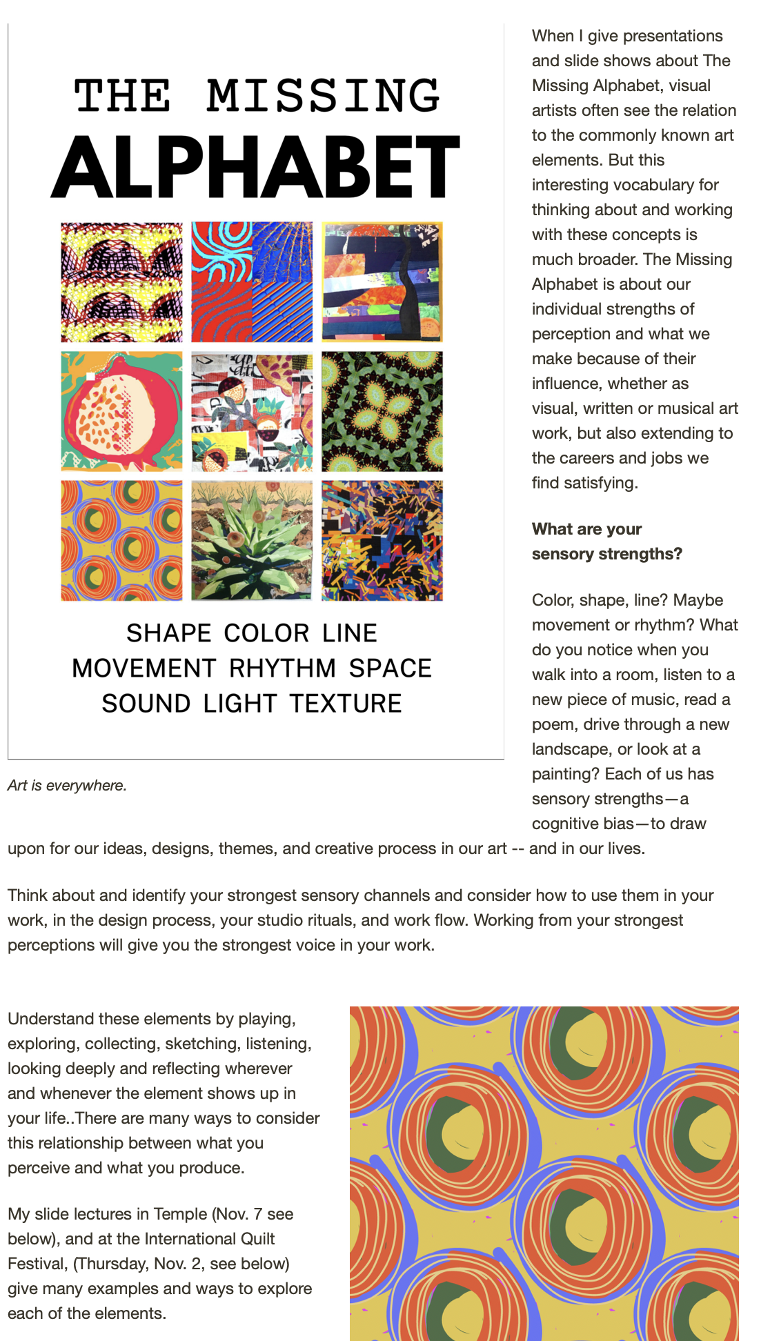


 Tallinn, Estonia, Old Town
More photos from the Scandinavian trip this summer: these screamed "color" when I went though the digital stacks. I love digital photography, but you have to admit that it makes editing an essential part of the process. Back in the film days, I could never have brought home 2000 plus photos! If you've just tuned in, I'm taking the next seven days (plus yesterday and today) to post pictures from our big summer trip/cruise sorted by categories of the Sensory Alphabet.
Here are some ways that colors in photogrphs (my own and other's) inspire my work:
1. If theiy're mine, I use the photos directly, printed on fabric or other strange materials, then use them as a collage element in my art quilts, or even as stand-alone small fiber pieces with stitching and over-printing.
2. I notice what works compositionally with color in a favorite photo, then let that proportion or relationship inform a piece of work.
3. I like to play a color matching game, mixing colors of paint or dye to match a color that I find striking in a photo or painting.
4. Especially with photos of the natural world, I find new and unusually color schemes that I wouldn't ordinarily think about. Coor is such an important element in my work, I am always working from both intuitive.
While specific images from this trip have not yet found their way into my work, I have gotten some interesting ideas for some new workshops, coming soon to this blog. Meanwhile, here's the color selection to inspire your work!
 Grocer's shelf near Highgate Village, London
 Hydranga blooms at the V&A, London
 Very old stained glass panel in the V&A collection
 St. Petersburg, Russia
 Summer Palace outside St. Petersburg